The Heart of the Home
Perfect? Don't be fooled. We're still sleeping on a mattress on the floor of our master bedroom. Tyler has only been thiissss close to wiping out about 10 times thanks to the fact that the rug under the mattress has no rug pad and basically acts like a giant surfboard. :) It's pretty comical until about 3am when you try to stumble out of bed to go to the bathroom and nearly fall flat on your face. Ha!
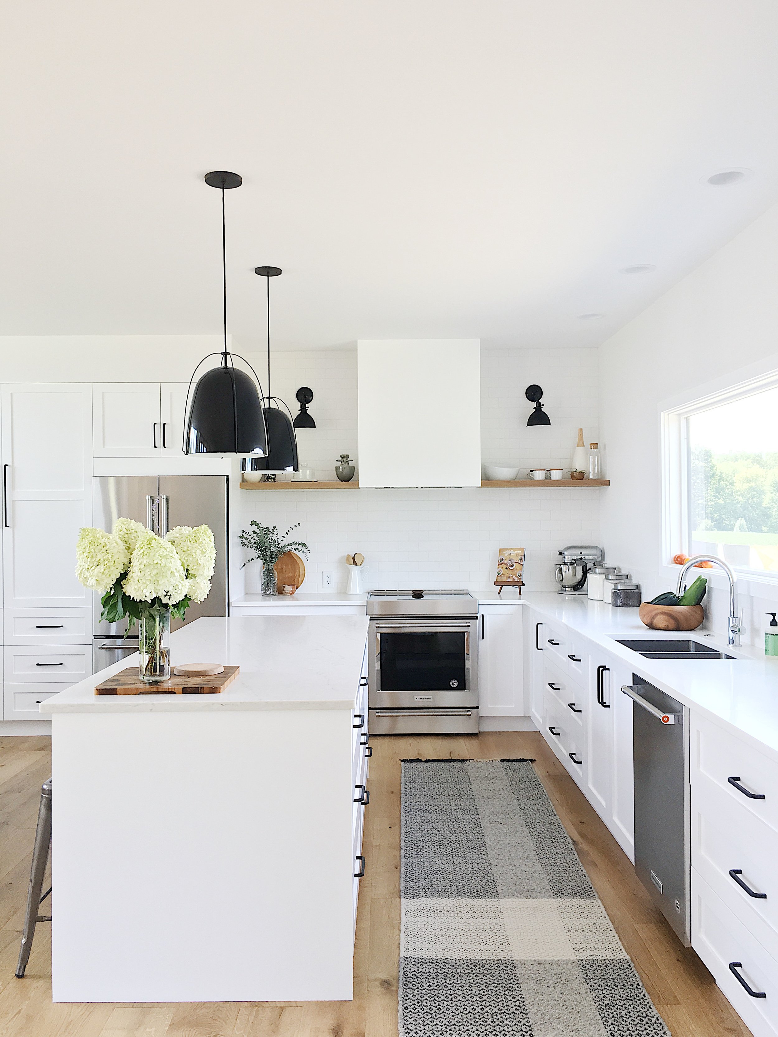
Everything may not be perfect (no matter how hard I inevitably try), but it sure feels like home. This kitchen is everything I dreamed it could be. Light, bright, and tons of space to make a mess. We're three months in and I wouldn't change a thing.
You may not believe me when I say this, but it's a really easy space to clean! Tyler and I spent more time than I'd like to admit designing the entire thing using IKEA's online kitchen planner, and a big part of that planning revolved around keeping the space functional, efficient and easy to to clean up. For someone as OCD as I, these are not "nice to have" qualities but rather necessities.
The space may not revolutionize the kitchen design world, but it does prove that simple is often best. Did you notice that we have no upper cabinets? When I originally told people this, they thought I was crazy. The lack of cabinets, however, really helps keep things feeling light and airy. Plus, our entire first floor is one big open space, so you can simultaneously be in the kitchen, dining room, and living room. The minimal cabinetry helps keep the footprint flowing and not feel so kitchen-y amongst the other spaces.
The cabinets we do have are all drawers. Drawers, my friends, are the key to organization. When you have the ability to fully extend your storage space, nothing ever gets "lost in the back". IKEA also sells awesome hidden drawers. It's basically a drawer within a drawer and is one of my favorite features... right behind soft close hinges. No more slamming cabinets? YES, PLEASE.
I often get asked if the white counters are hard to maintain, but I have found them to be WAY easier than our old dark counters. Basic soap and water is my main go-to, but if I have a really stubborn spot, a little Bar Keeper's Friend and a Magic Eraser does the trick every time.
The same goes for our white cabinets. The fronts are the "DIY Shaker" from Semihandmade which we had painted white. These things have already seen their fair share of spaghetti sauce, beet juice, and wine splashes, but they wipe up like a dream. I REALLY considered going with a fun color on the island - it was actually in my original design plans - but I ultimately decided to go all white. Why? Mainly for the same reason as the no upper cabinet choice. I wanted the entire space to feel light and bright. I wanted the eye to carry right through to the true beauty - the 8.5 acres right out those big windows.
Since so much of the kitchen is white, a few black accents and a little wood here and there really helps bring a bit of warmth. Black is such a classic accent, and I really think it helps make things feel a bit more modern. We may live in the country and have a house shaped like barn, but we definitely like clean lines and minimalistic style.
I have cooked dinner in this kitchen just about every night since we moved in. It has already seen it's fair share of cookies, cakes, pastas, salads, and veggies. I have always loved to cook and share meals with friends and family, and I'm thrilled to have a space to do just that. I can only hope that the next 30 years are filled with as much time in this space as the past 3 months. I truly hope that my feet leave their mark in those beautiful floors and that all who visit feel at home as much as we do.
WALL PAINT: Dunn Edwards “Droplets” | CABINET PAINT: Dunn Edwards “White” | CABINET BASES: IKEA | CABINET FRONTS: SemiHandmade | SINK: Elkay | FAUCET: Delta | HARDWARE: IKEA | WALL SCONCES: Rejuvenation | PENDANTS: Rejuvenation | APPLIANCES: KitchenAid | VENT HOOD: Custom | FLOORING: Timeless Designs “Venezia Oak” | WINDOWS: Pella | COUNTERTOPS: Island – Mont “Rhapsody” ; Exterior – Colorquartz “Frost White” | BACKSPLASH TILE: 3×6″ subway in matte white w/ “Bright White” (910) grout | STOOLS: Target | RUG: Rejuvenation (Sold Out) ; Similar


