Kitchen Renovation
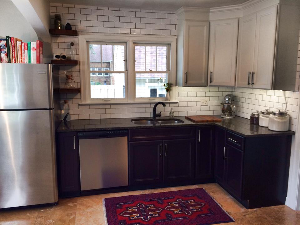
When I shared our Kitchen-Nook DIY a few weeks ago, I promised a summary of the entire kitchen renovation. We've been working on our kitchen for quite some time now, and we're almost (finally) finished! SO CLOSE! But let me tell you, WHAT A PROJECT. Let's take a look...
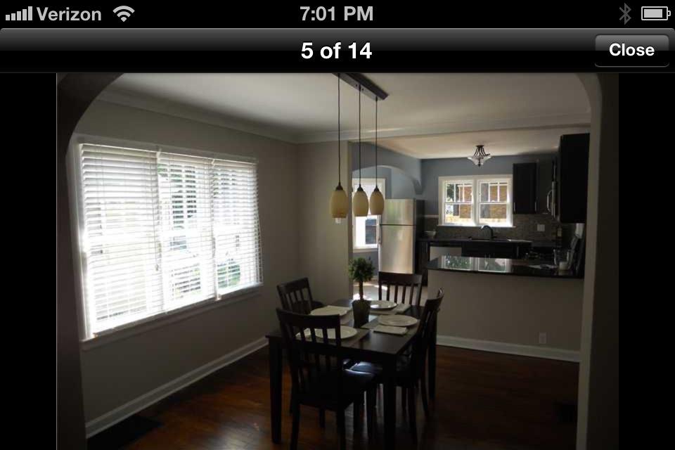
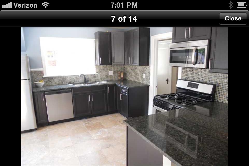
Here are a few "before" screenshots I saved on my phone when we purchased our home.
The kitchen had been completely overhauled right before we moved in, so it was great to have brand new appliances, cabinets, and tile. We definitely could have moved right in and not done one thing to the space. Buuutttttt, hardly a single thing in the kitchen was my style. Blue walls? Really??? I completely understand that a whole lot of people out there love the color blue. I just don't happen to be one of them.
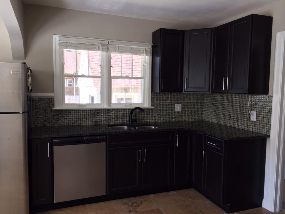
So shortly after we moved in, the walls were re-painted and I was feeling slightly better about the space. Well, except for that back splash. Oh, and the dark cabinets. And the lighting. And the faucet. And the countertops. Well, you get the idea. ONE STEP AT A TIME, KELSEY!
I ended up going through about three different paint colors over the course a year in an attempt to feel better about the look of the space and finally landed on Benjamin Moore Revere Pewter. It was a huge improvement from the baby blue, but no amount of paint was going to disguise that blue/green back splash tile. Did I mention I don't like blue in my kitchen?
As you can see in the photos above, our granite counter tops are a really dark shade of green. Of all the options out there, I'm still not quite sure why the previous owners decided on green. If I had my choice, we would have white quartz. Beautiful, shiny, CLEAN, white quartz. It would be BEAUTIFUL! But no, we're stuck with green. Tyler wanted to rip them out, but we finally decided that taking out perfectly good granite counter tops was a complete waste.
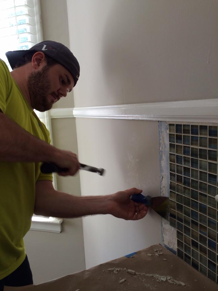
The solution? Brighten up the cabinets and install a new back splash. My thought was that if we lightened up the rest of the space, the dark green countertops would be a lot less noticeable. Plus, the dark color really hides dirt well, so we might as well give it a shot. I've always dreamed of a white kitchen, so lightening up the cabinets was a no-brainer. I also really like the look of subway tile, so we decided to start planning around those requirements. I searched magazines and Pinterest endlessly for ideas, and finally came up with a game plan. First up? Tear out that blue/green tile!
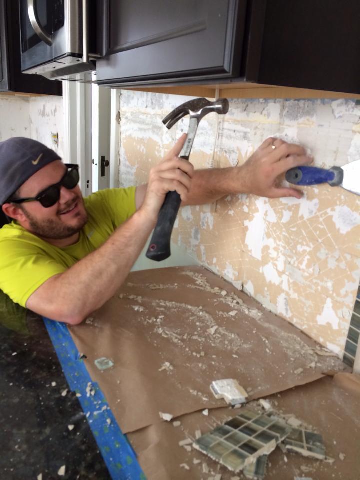
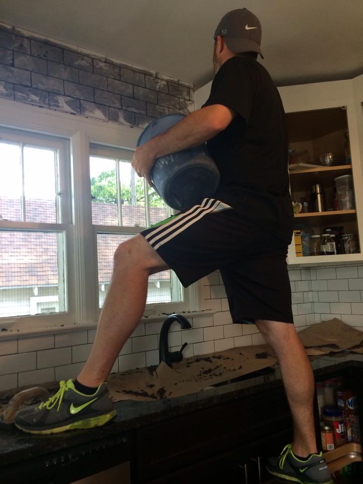
*Eye protection is the key, folks.*
We also took all of the cabinet doors off the hinges to prep, prime and paint. The plan was to paint the uppers white and the lowers a dark gray.
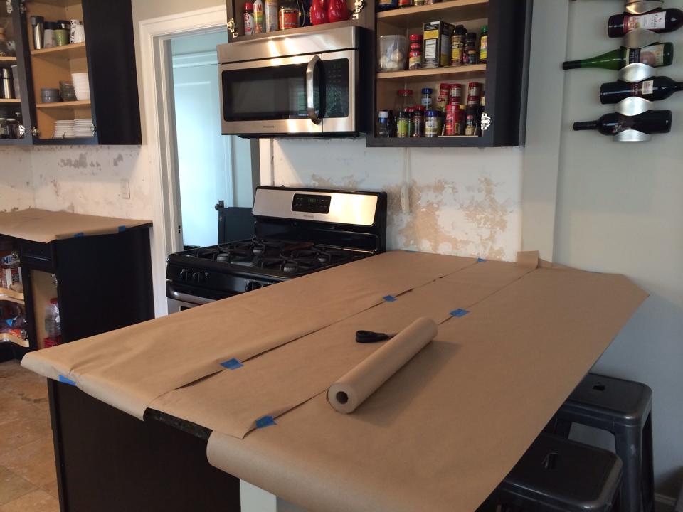
We had no idea how much damage would be caused by tearing down the old tile, but we were pleasantly surprised to be be finished and cleaned up within just a few hours. We actually tore everything down the weekend before installation to ensure we had plenty of cushion for "complications". We used that time to prep the walls and sand down any major rough spots. By the next weekend, we were ready to start installing the tile!
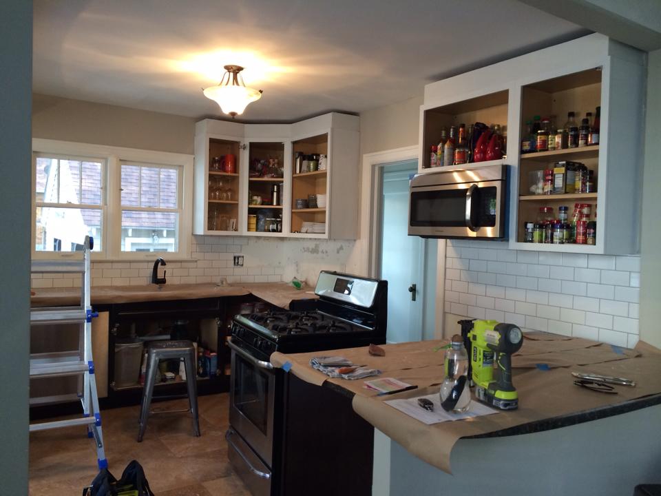
We also applied our first coat of primer on the cabinets and put up as much tile as we had on hand. (The truck delivering the rest of our tile broke down and was delayed for a day.) Oh! And also please note the difference in cabinet height in the photo below. Do you see how the cabinets are almost touching the ceiling now? We decided to add some molding to extend the eye up - giving the illusion of higher ceilings.
At this point we were feeling pretty good about things. The cabinets had been primed twice. We had successfully learned to use the tile saw. A good portion of the tile was on the wall (and not falling off). AND we hadn't killed each other - yet.
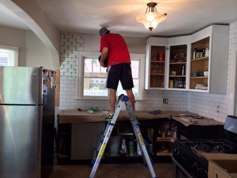
Next up? More tiling. And then more tiling. AND THEN MORE TILING.
Continuing with the illusion of taller ceilings/bright spaces, we also continued the subway tile all the way up to the ceiling. I'm SO happy we decided to do it, but I sure wasn't happy about all of the cuts. Can you say TIME CONSUMING? We seriously thought we would be able to get the rest of the tile finished and grouted by the end of that second day. HA. HAHAHAHAHA. Good one. Nope, we literally spent an ENTIRE DAY just installing the tile up to the ceiling above the sink and above the doorway.
So, on to day 3. Grout! Finally...
We decided to go for a modern take on subway tile by using charcoal grey grout. Great for contrast - not so great when smudged against our white trim....
This is seriously how we felt at this point. OVER. IT.
Grouting tile is a pretty simple task, but it sure is a labor of love. I spent most of the day forcing grout in between tiles with my fingers and then using a damp sponge to wipe everything clean. I suppose the good thing about dark grout is that you can pretty clearly see if you've removed all of the residue or not.
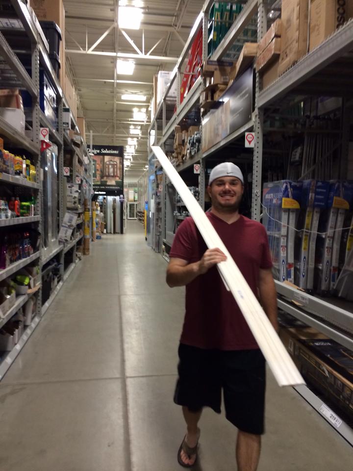
Once the grout was FINALLY finished, we moved on to painting the cabinets and installing crown molding. We ended up painting only the upper cabinets. At the last minute, I had second thoughts about the lowers, so we decided to leave them as-is. As for the crown molding, have you ever installed that stuff? It takes some SERIOUS math skills - especially when you're dealing with a BAJILLION angles all at once. I honestly thought Tyler might go crazy. He spent hours (HOURS!!) working on those stupid angles. We originally bought an entire extra board just in case we had a few slip ups. Well, low and behold, one extra board wasn't enough "error room", so we had to make another trip to Lowe's. Tyler was pretty excited.
At least it was a pretty night....
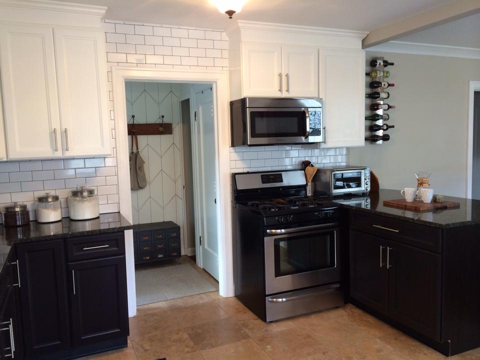
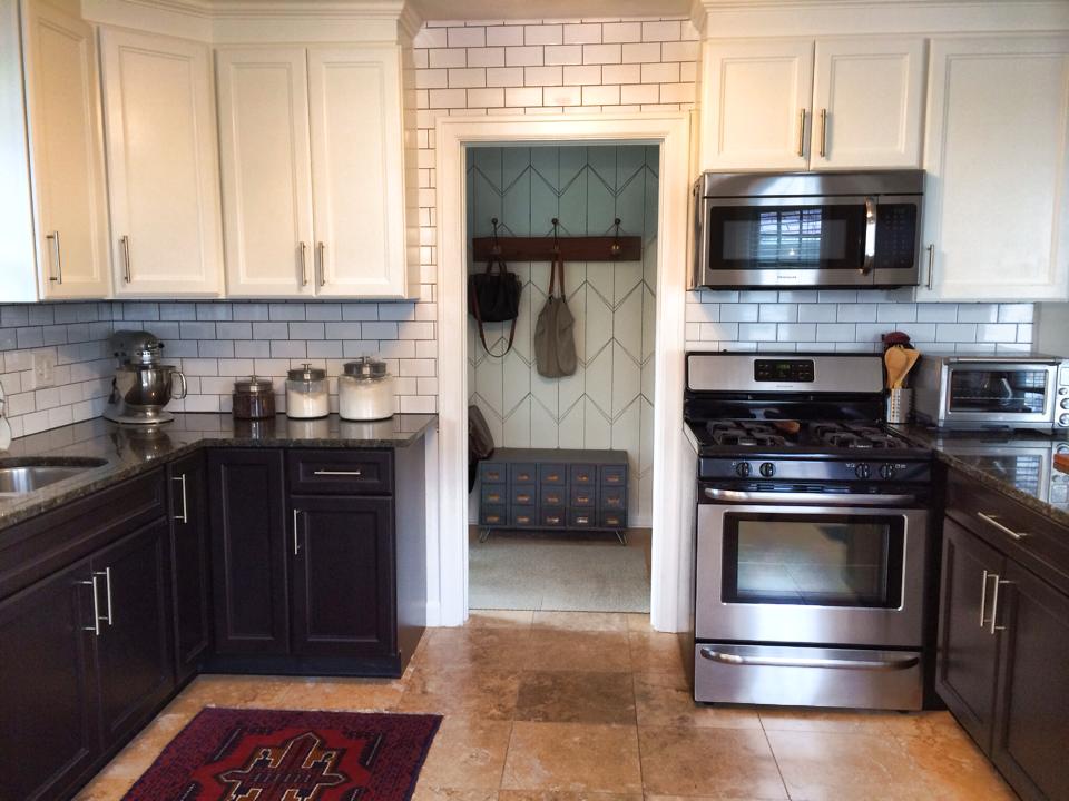
Have no fear, we were able to figure out all of those tricky angles and install everything to look like this!
Two coats of primer, three coats of paint, and a lot of caulking and sanding later, the cabinets and molding were finished!
It was a lot more work than we initially estimated, but it was COMPLETELY worth it.
So I mentioned that we're ALMOST finished. What's left? A new overhead light is our top priority. The current one is hideous, but I'm trying to find exactly what I want. We're also thinking about painting the lower cabinets this winter. I'm okay with the current look, but Tyler would really like to paint them with the Benjamin Moore Kendall Charcoal paint we initially purchased. We'll see... :) Also on the maybe list? A new faucet. I'd REALLY like to install something like this...
All in all, we're thrilled with the results to-date! It took a lot of time and effort but relatively little money to make a significant impact.
SOURCES: Kilz Primer Seal & Stain Blocker // Upper Cabinets - Benjamin Moore White Dove // Imperial Bianco Subway Tile // Charcoal Sanded Grout

